

Garbage in = garbage out. Make sure to have your time series data formatted nicely. This means:
This is an example of a good file (time = green, units = blue):

Marple supports other data types, such as MAT, HDF5, ULOG, MDF, and more.
Read data formats docsCreate a free account by signing up on app.marpledata.com. Verify your email.
Create a free accountGo to the data library and press Upload Files. Select one or more files that you want to visualise.

Marple will show you a preview of the file. Verify that it looks good and click Import.

Wait for the file to finish importing. Then select the file (checkbox) and click Visualise.

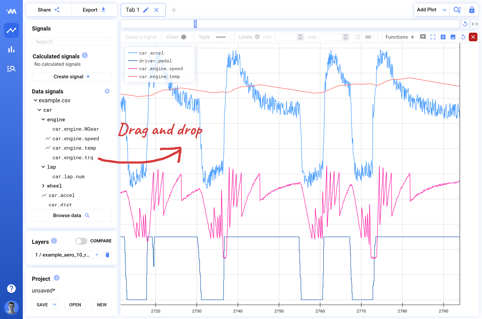
You can now start dragging signals from the sidebar onto the plot. Enjoy your graphs!
Summary
Marple has much more to offer.